Refining BlueBox for Reliability and Scalability
Context
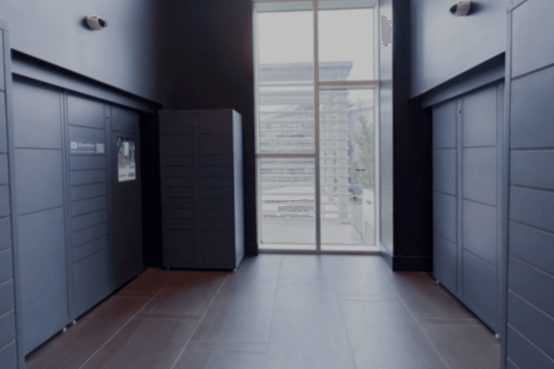
BlueBox is a smart locker system operating across 300+ residential buildings in Metro Vancouver, supporting over 5,000 daily deliveries.
As BlueBox scaled, recurring support patterns revealed reliability gaps and fragmented experiences across residents, couriers, and building staff, increasing operational overhead and support dependency.
This project focused on strengthening reliability, reducing friction across digital and physical touchpoints, and improving operational efficiency through more scalable experiences.
Team
1 UX Designer, 2 Developers, 1 QA Engineer
Duration
4 months

problem space
Recurring support patterns revealed broader system gaps across the locker experience.
// Reviewing customer support inquiries revealed recurring themes that pointed to broader system-level issues rather than isolated interface problems. These patterns informed three focus areas that guided subsequent design efforts.
30+%
False drop-offs causing empty pickup experiences
10+%
Inconsistent interface patterns creating user friction
10+%
Lack of on-site control for building management
I got a text that my package was delivered, but the compartment was empty. What’s going on?
The design is messy and nothing works like you’d expect, just totally not worth the hassle.
I’d like to unlock the compartments at the locker without using the physical keys provided.


Problem Investigation 1
How false drop-offs created empty pickup experiences
// Deliveries could be marked as complete even when no parcel was deposited.
How the Failure Occurred
A missing confirmation step allowed couriers to close a compartment without depositing a parcel, while the system still marked the delivery as complete.

Courier
Selects the wrong compartment size while depositing
The compartment opens, but the parcel doesn’t fit
Closes the compartment without depositing
The user receives a false pickup notification
The user opens the compartment and finds it empty
The user contacts customer support to report the issue
Resident

Impact
This issue alone generated 3+ support inquiries per day, creating avoidable operational overhead and unnecessary resident frustration.
Design Response 1
Adding confirmation before delivery completion
We introduced a confirmation step before deliveries could be marked as complete.
Confirming intent before completion
Before completing a deposit, couriers are prompted to confirm that a parcel has been placed inside the compartment. This confirmation prevents empty compartments from being recorded as successful deliveries and reduces false pickup notifications for residents.
Confirmation is required before a delivery can be completed.
outcome
This change reduced false drop-offs by ~50% and decreased related support inquiries by ~35%.
Problem Investigation 2
Reducing friction caused by inconsistent design
// As the product evolved, inconsistent layouts and interaction patterns created unnecessary friction across key user workflows.
Identifying key breakdowns
Although these issues appeared in different workflows, they shared the same underlying cause: inconsistent layouts, form structures, and interaction patterns.
Registration Workflow
Inconsistent layouts and form logic increased user errors, making the registration flow difficult to complete.
Mixed information hierarchy
Competing primary actions
Unclear registration flow
Unclear error guidance
High cognitive load

Support Inquiry Workflow
Missing fields and unclear labelling led to incomplete submissions, making the support form difficult to navigate and complete.

Vague information grouping
Missing key information
Hard to find key actions
Poor visual hierarchy
Inconsistent tabs
Lack of visual cues
Impact
These inconsistencies reduced task completion, increased back-and-forth with support, and created unnecessary operational overhead.
Design Response 2
Establishing a design system
To reduce friction caused by fragmented interfaces, we focused on establishing a consistent visual and interaction language across the app. This helped users complete key tasks with greater confidence while reducing errors and unnecessary support interactions.
Building shared foundations for consistency
We created a shared design system that standardized visual hierarchy, reusable components, and interaction patterns across the product.

Shared components and interaction patterns created greater consistency across forms, navigation, and system states.
This foundation was then applied across high-impact workflows.
Applying shared patterns across critical workflows
Representative screens showing how shared design patterns were applied across key workflows.
Simplified Navigation Paths
Removed unnecessary steps and navigation depth.
Clear Visual Hierarchy
Established consistent visual hierarchy.
Reusable Interaction Patterns
Applied reusable components and patterns.
Unit registration

Unit Management List / Unit Registered Contact List / Unit Regirtration Form
Support Inquiry

Support Center / My Support Tickets / Create a Support Ticket 1 / Create a Support Ticker 2
outcome
Shared design patterns created a more consistent experience across registration and support workflows, reducing friction and making key tasks easier to complete.
Problem Investigation 3
Building staff lacked direct control over locker operations
// As the system expanded, building staff lacked a clear operational path to resolve locker issues independently, creating delays and added reliance on support.
Operational roles and access boundaries
Role mapping revealed a missing operational role between couriers and residents. Building staff needed dedicated permissions to manage lockers independently without relying on support.
Deliver packages
Retrieve packages
Existing Roles
Courier
Resident
New Operational Role

Building Management
Disable compartments to repurpose them as internal storage
Unlock compartments individually or all at once
Control multiple locker sets at once with a single unlock action
Design Response 3
Introducing the Staff Control Panel
To support on-site operations as the system scaled, we introduced the Staff Control Panel, giving building managers secure on-site access to manage lockers without relying on physical keys or remote support.
Providing secure on-site actions at the locker
We introduced the Staff Control Panel, including secure staff login and on-site management tools that enabled building managers to perform essential locker operations directly at the locker.

The Staff Control Panel enables building managers to perform essential locker operations directly on site.
outcome
The Staff Control Panel reduced management support requests by ~30% and improved issue turnaround during daily operations.
Product Impact
Reduced
false drop-offs
~50%
Deliveries incorrectly completed without a parcel.
Reduced
support inquiries
~35%
Resident support requests related to false pickups.
Reduced
management support requests
~30%
Management requests requiring remote support.
// Metrics are rounded for confidentiality.
a few final thoughts

Users judge products, not systems
Even when verification and authentication were outside the product's design scope, they continued to shape how users perceived the overall reliability of the experience. This reinforced that users evaluate the product as a whole rather than individual systems.
Product design extends beyond interfaces
Addressing operational challenges required more than improving screens. Defining roles, permissions, and shared interaction patterns became as important as interface design, expanding my perspective from designing interfaces to product systems.

